Annual Survey Challenge
Submissions
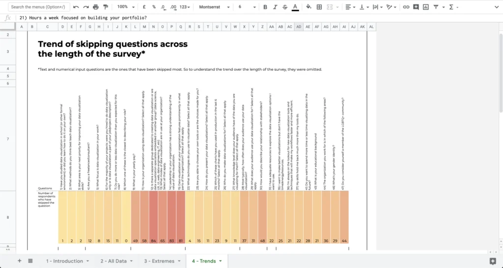
Skipped!
explanatory
Prachi Tank
DESCRIPTION: The visualisation aims to understand respondents trends of skipping answers in a survey. It explores the possibilities and limitations of Google Sheets to create…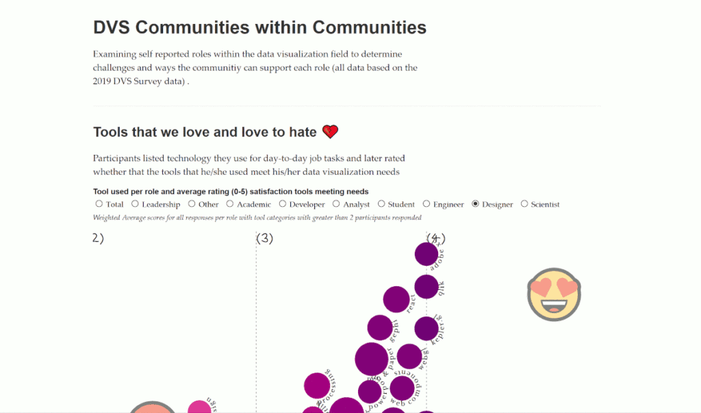
Communities within Communities
explanatory
Amber Hoak
DESCRIPTION: A little explanatory and a little exploratory, this notebook examines self-reported roles and what common threads between role communities within DVS. It looks at…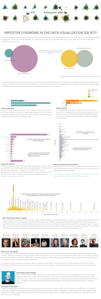
Imposter syndrome in the Data Visualization Society
explanatory
Maria Alex Ilie
DESCRIPTION: A dashboard made from the perspective of a beginner to help understand how to grow as a data professional while looking at experience distribution…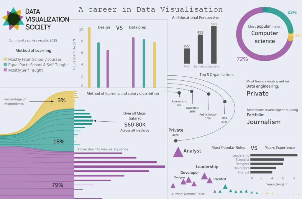
A career in Data Visualisation: Insights into learning methods.
explanatory
Armani Eloise
DESCRIPTION: A focus on the method of learning:Is educational background, career, salary, role and sector of work linked to the way we learn data visualisation?…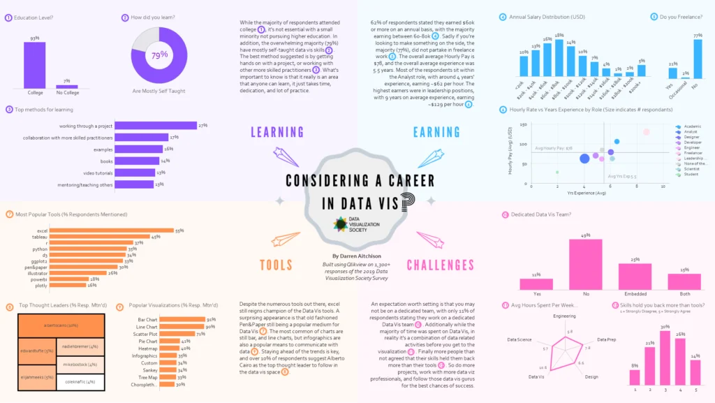
Considering a Career in Data Vis?
explanatory
Darren Aitchison
DESCRIPTION: Like most in the profession I stumbled into data visualization, looking through the survey results it reinforced my belief that anyone can learn data…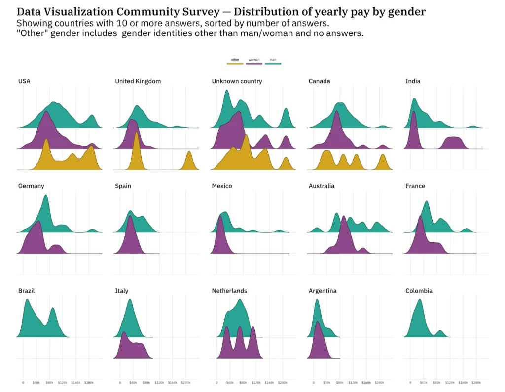
Distribution of yearly pay by gender
explanatory
Georgios Karamanis
DESCRIPTION: A ridgeline plot showing the distribution of yearly pay by gender in countries with 10 or more answers.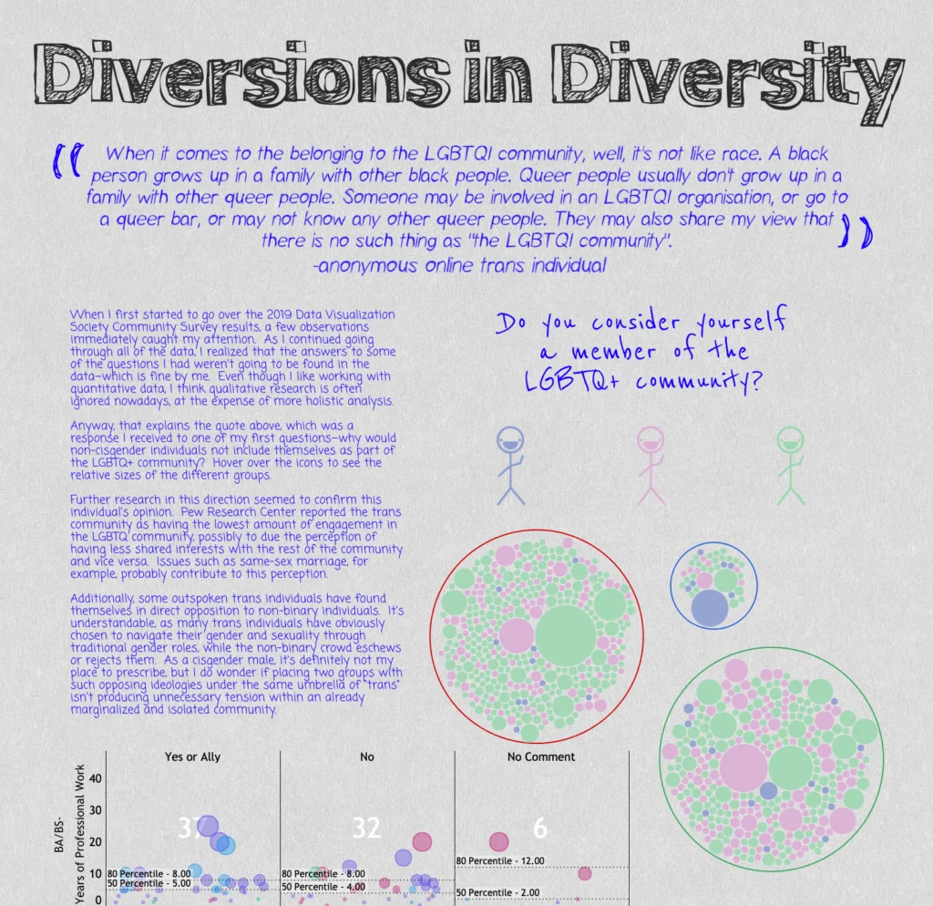
Diversions in Diversity
explanatory
Jonathan Yu
DESCRIPTION: Short explorations of interesting or odd observations found in diversity-related data.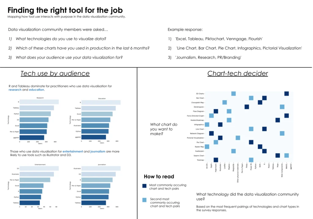
Finding the right tool for the job
explanatory
Matthew Garrod
DESCRIPTION: This chart explores how members of the data visualization community use different tools and chart types for different purposes. It focuses on user’s responses…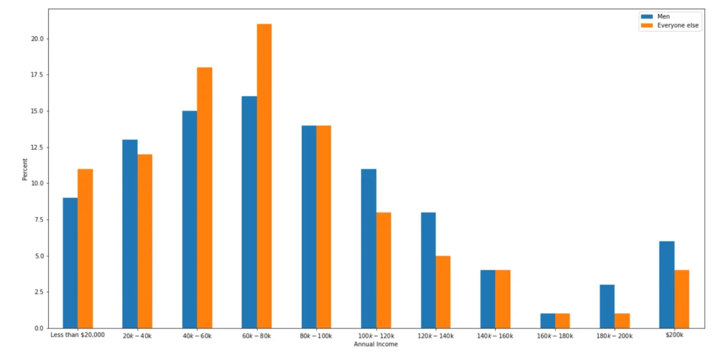
Income distribution by gender
explanatory
Kathy
DESCRIPTION: When looking at the annual income of survey takers, there are more men earning at higher brackets than other gender identities. This definitely warrants…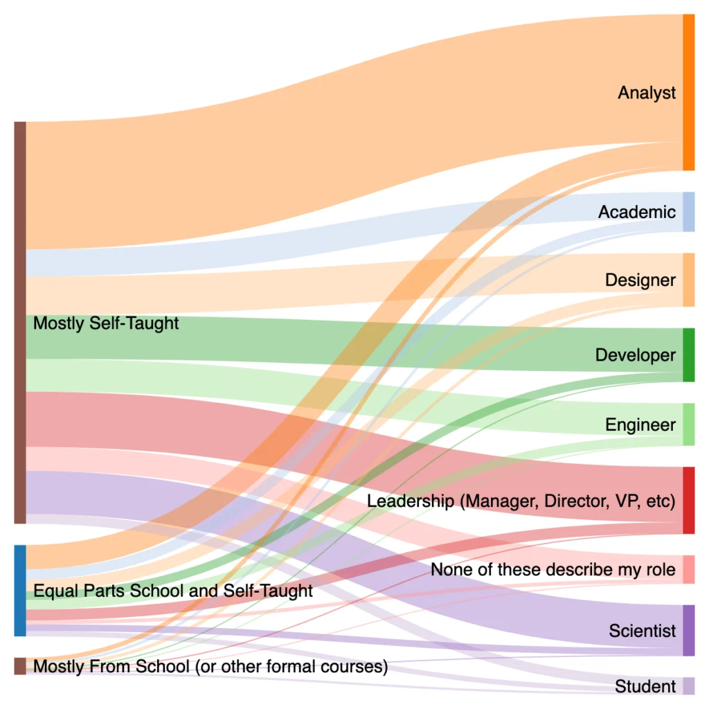
Industry Flow Based on Data Education
exploratory
Barbara Donnini - Boxplot Analytics
DESCRIPTION: This basic Sankey diagram shows the flow of survey respondents, starting from their current level of education in data analysis. The beauty of a…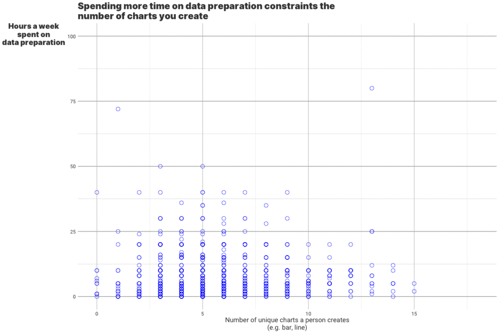
One fact about number of charts you create and time you spend on data preparation
explanatory
Konstantin Zhitkov
DESCRIPTION: Spending more time on data preparation constraints the number of charts you use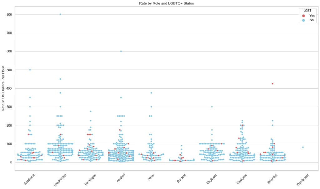
Rate by Role and LGBT Status
explanatory
Barbara Donnini - Boxplot Analytics
DESCRIPTION: Each point on this chart represents a survey respondent. We can see patterns within each of the professions for hourly rate. For example, the…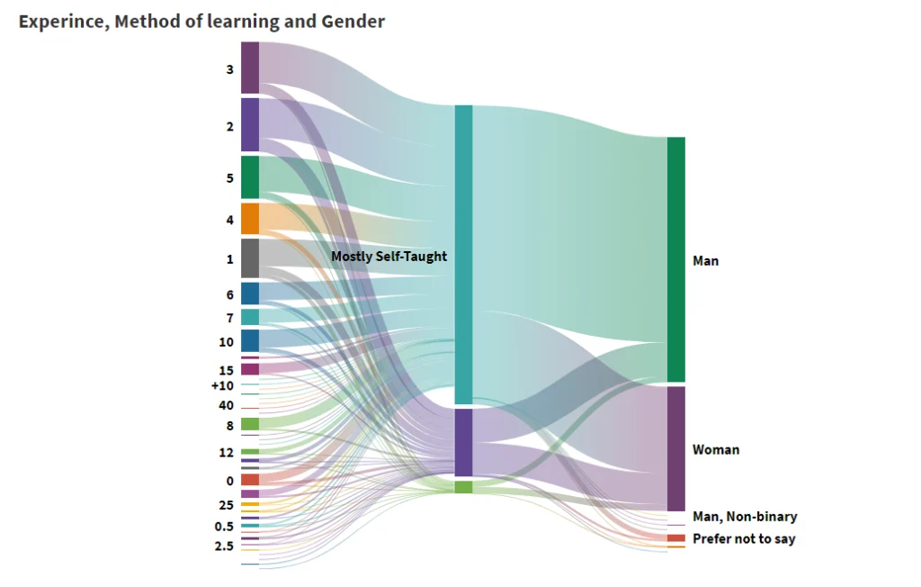
Story of Data Visualization Education
explanatory
Gauri Tillu
DESCRIPTION: The following visualization shows the number of years of experience that people have with a comparison with their method of learning and the gender…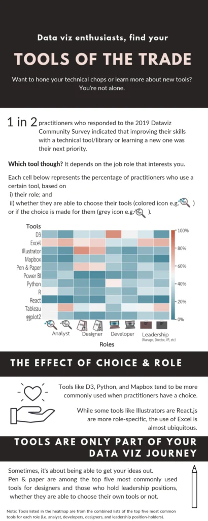
Tools of the trade
explanatory
Alexandra Khoo
DESCRIPTION: The newbie's question 'Which tool should I learn?' doesn't always get a satisfactory answer. This data viz aims to shed some light by highlighting…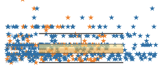
What focus is Data Visualisation in your work?
explanatory
Wendy Small
DESCRIPTION: How do tasks vary across Data Viz focus levels? PROCESS: * An article by Shirley WU helped with the data prep and inspired the…