Black in Data Challenge
Judging
Submissions were judged on their message, design, and clarity.
Judges
Dr. Ruth Agbakoba has a rich background working at the forefront of innovation leading on the deployment of the UK’s First AI supported EHR integrated Clinical Trials Discovery Platform.
Simone Webb is a third year PhD student in Bioinformatics and Immunology at Newcastle University. She is interested in using coding to understand how our immune systems develop.
Markia Smith is a 3rd year PhD student in Pathobiology and Translational Science. She uses integrative genomic approaches to study how social and environmental factors impact cancer health disparities.
BlackInData Visualization Challenge
The Data Visualization Society is collaborating with BlackInData by providing our platform to present the #BlackInDataViz challenge as part of #BlackInDataWeek!
BlackInData represents a community of academics, professionals, and students working in various areas of data. They gather to support, learn from, and share opportunities with one another, and ultimately increase representation of Black people in data fields.
Introduction
In partnership with BlackInData, we are co-hosting the “Black In Data Visualisation Challenge” to showcase the data visualisation skills of the many talented people within the Black/African Diaspora across different interests. This competition serves to make room for all visualizations that demonstrate something that you are passionate about – we welcome submissions that highlight culture, expose social injustice, and/or any of your special interests.
Please feel free to use any dataset and data visualisation method for your submission for this competition. Below you will find links to four recommended data sources to use, but you are more than welcome to use a data source of your choosing.
Eligibility criteria
All competition entrants must identify as a person of the Black diaspora from any part of the world. In submitting your image to us, you confirm that you have performed the data analysis to produce the image yourself. You also give permission for us to share the image with our judging panel, host your image on the Data Visualization Society online gallery (with your name accredited), and to share the image on the Black In Data twitter (with your name accredited).
Suggested Datasets
Contact
If you have any questions, please email Kailande and Victor at blkindatagroup@gmail.com with “DataVizChallenge” as the subject line.
Submissions
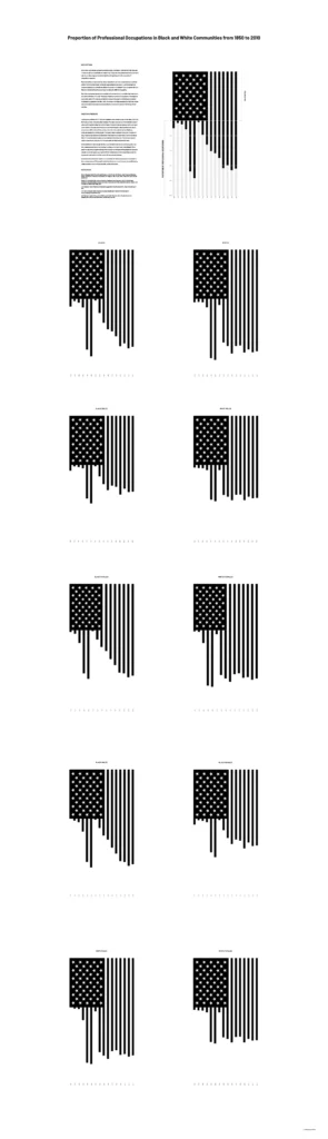
Proportion of Professional Occupations in Black and White Communities from 1850 to 2010
Camaal Moten
Created by Camaal Moten The American flag is a symbol of unity, liberty, and justice for all. It can sometimes be seen tattered and torn…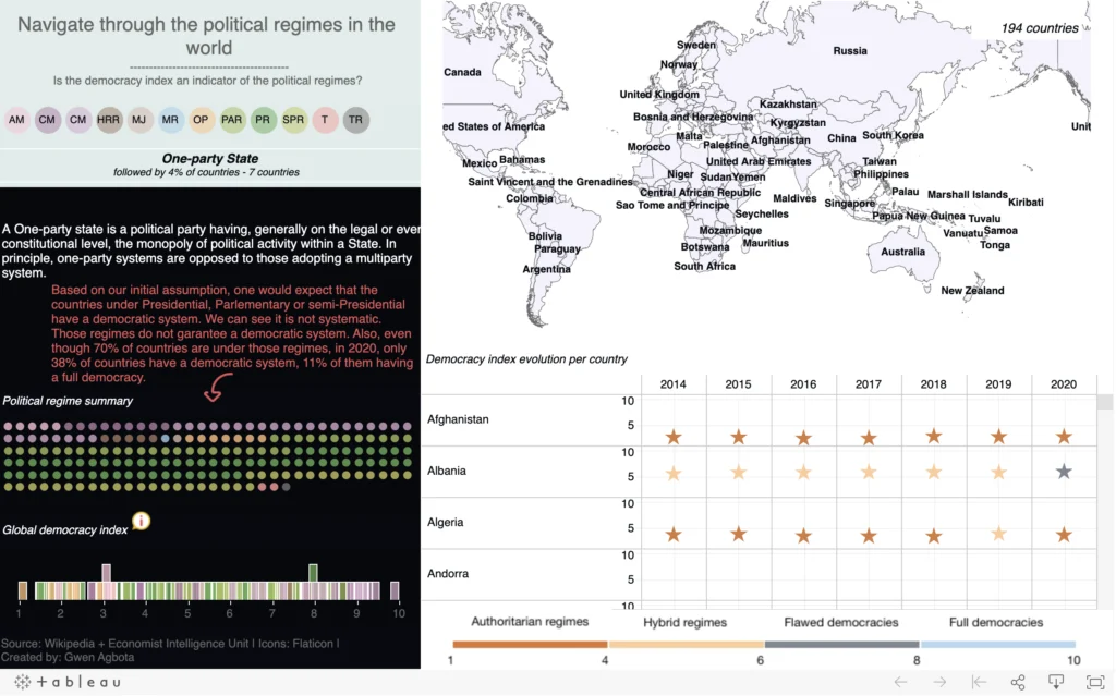
Political regimes in the world
Gwen Agbota
Created by Gwen Agbota My ambition with this visualization is to show the state of the world based on the democracy index and the political…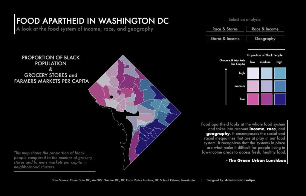
Food Apartheid in Washington DC
Adedamola Ladipo
Created by Adedamola Ladipo This interactive dashboard visualization shows an analysis of food apartheid in Washington DC by neighborhood cluster. Unlike the more commonly used…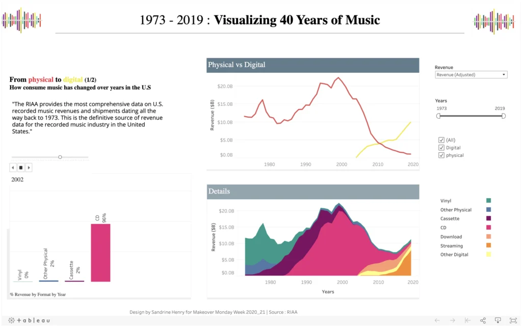
1973-2019 – Visualizing 40 Years of Music
Sandrine Henry
Created by Sandrine Henry One of my goals as a data analyst is to master the data visualization aspect. And of course one way to…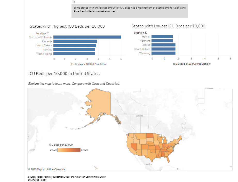
COVID19, Race, and Hospital Beds Dashboard
Andrea D Hobby
Created by Andrea D Hobby It is a viz that shows which racial groups are the most heavily impacted in a state. Also, it shows…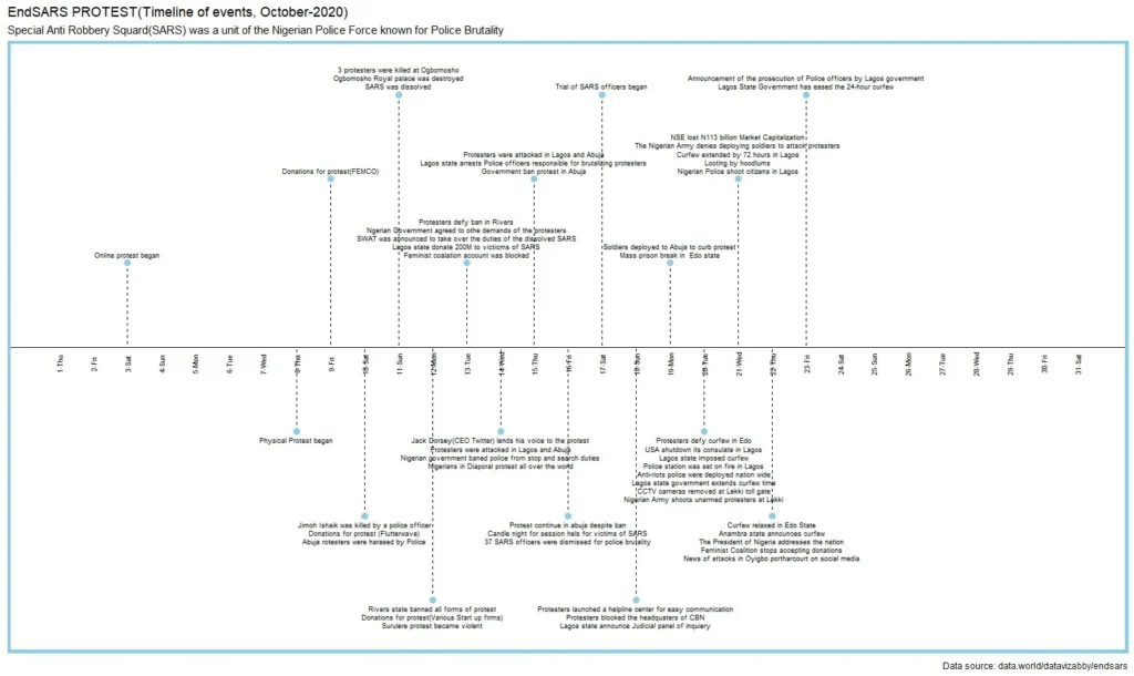
EndSARS protest Nigeria
Ikem Frank Uzoma
Created by Ikem Frank Uzoma My visualization shows the timeline of events of the endSARS protests that took place in Nigeria.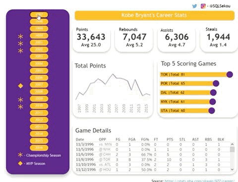
Kobe Bryant’s Career Stats
Sekou Tyler
Created by Sekou Tyler This #dataviz highlights Kobe Bryant’s NBA Career. I use data visualization as a way to be creative. I start with a…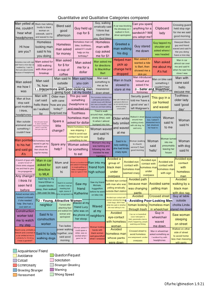
Sidewalk Interactions by Type
Ofurhe Igbinedion
Created by Ofurhe Igbinedion Descriptions of interpersonal sidewalk interactions are categorized by qualitative type (different colors) and quantitatively derived type (quadrant with white label).
Who’s in the Crossword?
Michelle McGhee
Created by Michelle McGhee Description of visual: A look at representation and inclusivity in crossword puzzles. Process for creating work: To generate the waffle charts…